Responsive vs adaptive web design
Responsive web design has its own characteristics which are totally different from adaptive web design. In this article, you will learn the exact difference between responsive and adaptive web design.
Responsive web design RWD is an approach of using flexible layouts, grids, images and CSS media queries to adapt the same URL and HTML code to desktop, tablets and smartphones. If the process is done correctly, your page is optimized across all devices ensuring quality user experience and facilitating for them to better make purchase decisions.

The same design fits desktop, IOS phones and tablets.
Why responsive design is highly recommended to use?
Google webmasters recommend to use RWD because of many aspects:
-
A single URL is used for the content which allow your users to better share and link to your content and google algorithms are more capable of assigning index properties to your content.
-
Loading time is less for users as they don’t need a redirection to get to the device optimized view.
-
It allows your site as well as google crawlers to save resources. Google crawlers detect your page once instead of crawling them several times with different google bot users to retrieve your content. This effectiveness has allowed google to better index your page content and keep it fresh.
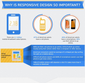
Responsive web design (RWD) has become important due to the rise of mobile usage. According to “who’s hosting this?”, responsive design is very important:
There are three major technical elements that responsive web design is composed of:
-
Fluid grids: A percentage based design that adapts to the screen size accordingly.
-
Flexible images: Images sized in their corresponding units to avoid them being displayed out of their containing elements.
-
Media queries: A way to apply CSS rules to the page based on the size of the displaying browser.
Google algorithms recommends to use the following CSS media query for smartphones: @media only screen and (max-width: 640px) {...}
Google algorithms look for the max-width values that relate to smartphone users screen resolutions.
Adaptive web design (AWD) on the other hand, uses series of static layouts based on breakpoints and adapt web pages on devices at three different sizes ; for example 320 pixels for mobile phones, 720 pixels for tablet devices and 960 pixels for desktop browsers. Adaptive Web Design doesn’t respond when you control your browser window as the responsive design does, it rather detects the device and requests the property sized layout to view. Using a predetermined set of sized layouts based on device screen size with Javascript and CSS3 media query, Adaptive web design approach adapts to the detected device.
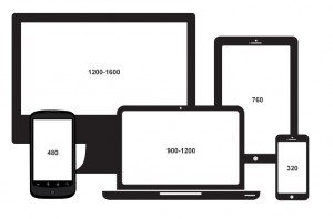
The same size could not fit all devices; each device has its own size.
There are three cores that set up the AWD approach:
-
Page content: HTML
-
Presentation:CSS and styling
- Client side scripting core: Javascript